
Early success hid the reason we couldn’t scale.
I led V1 & V2 - strong early adoption, followed by a plateau.
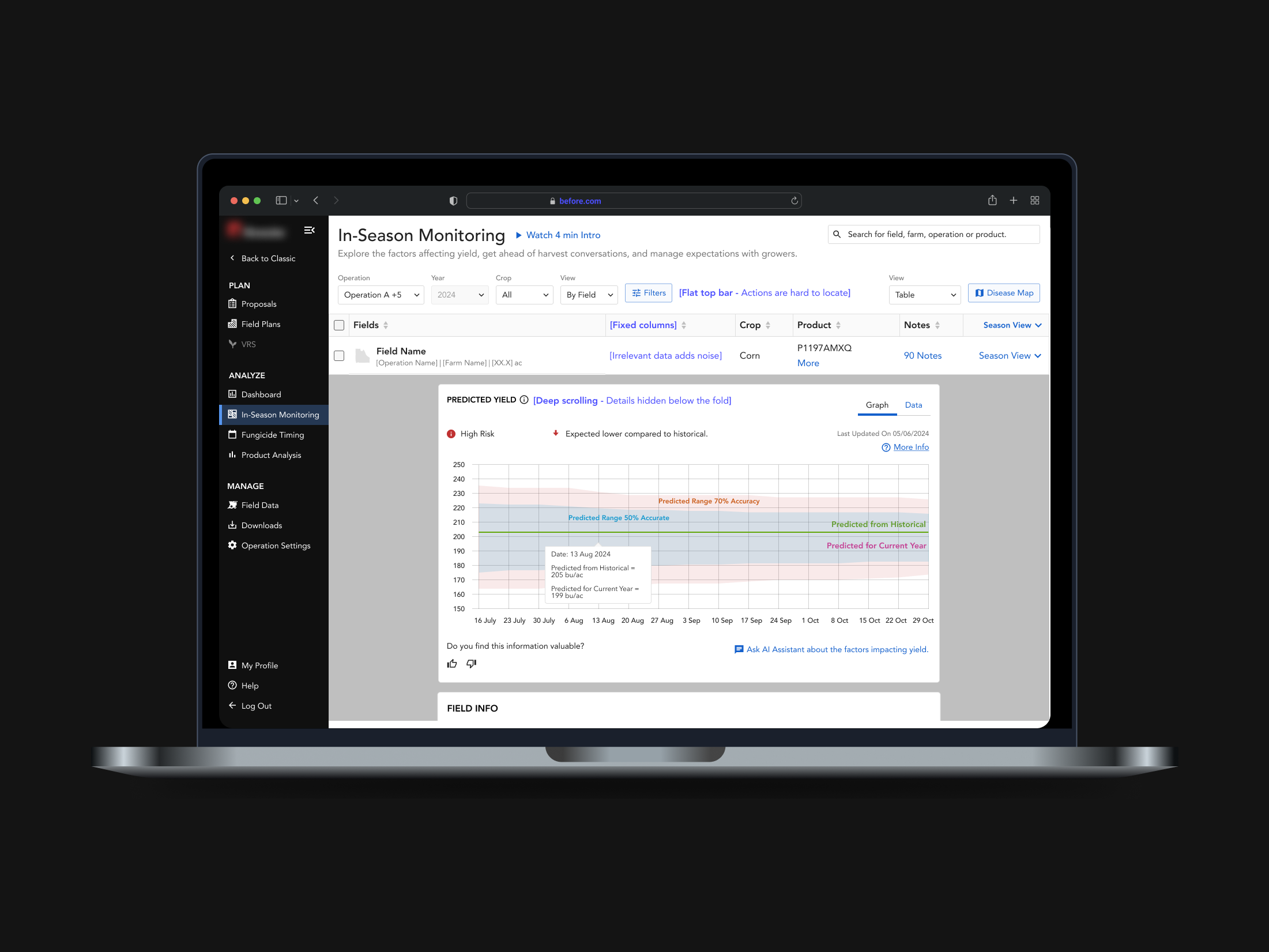
The product worked for power users. It failed new users.
This gap slowed growth.
New account creation dropped 11% in one quarter.
+ Growth required lowering the barrier to first meaningful action.
What changed in V3
Background
Agriculture Tech software that enables sales teams to guide farmers at scale
Narrow decision windows
Weather & disease uncertainty
Field-level variability
Financial stakes and Crop loss
User
One sales representative
manages 50+ farmers making decisions across 30,000+ acres.
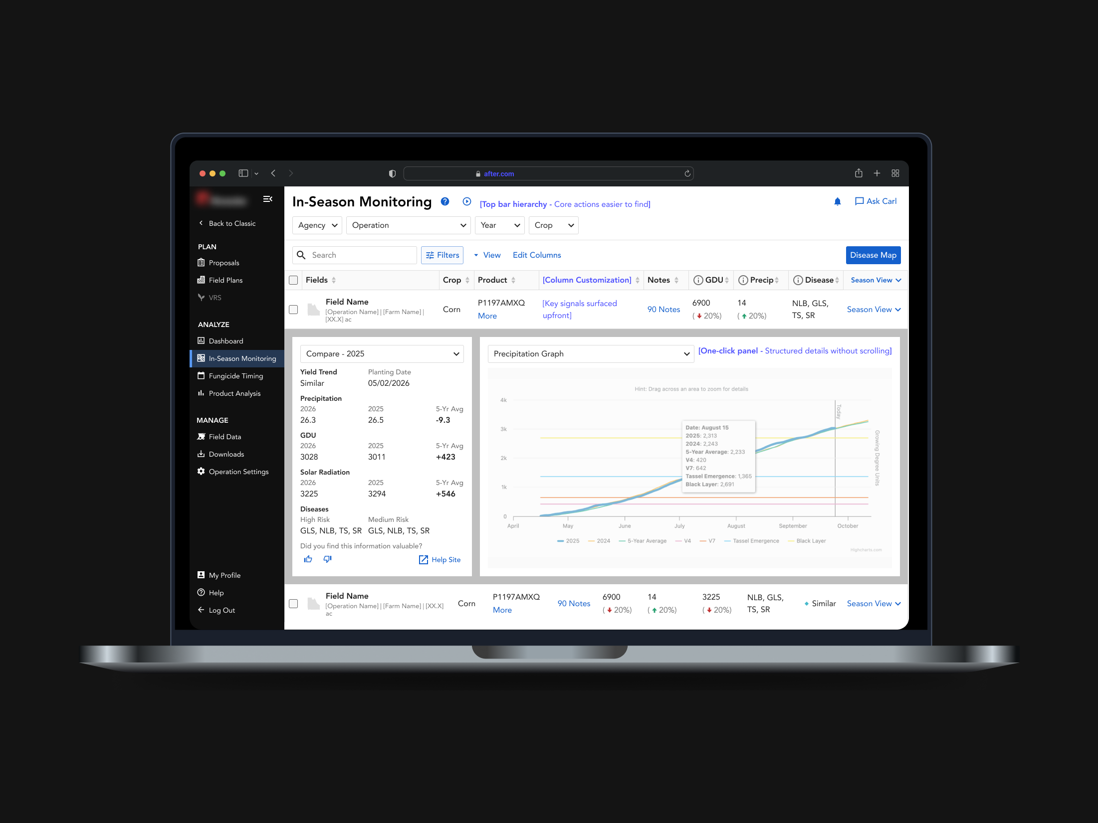
This tool enables earlier action.
Reducing crop loss by up to 30%.
V3 removed the barrier to first meaningful action.
Same data. Earlier access.
+14% Adoption growth after the previous plateau (in one quarter)
Driven by earlier access to decision-making signals.
+ This required restructuring how the system exposed value.
The strategic shift behind V3
The problem didn’t arrive fully formed.
Strong engagement in V1 and V2 created pressure to expand the tool to more users.
Business ask was to make this tool a magnet for new accounts.
But engagement had already plateaued.
+ Business was pushing growth without fixing activation.
How I reframed the problem
I traced what was limiting growth
Talked to power users.
Because business usually followed them. They liked the tool and wanted deeper views and more data.
Checked analytics when interviews didn’t explain the plateau.
V1 and V2 drove engagement, but first-time users showed a high drop-off rate.
Talked beyond power users.
For new users, on opening the tool, nothing felt decision-provoking, so they didn’t go deeper.
New users didn’t find a reason to act.
At year-end planning, the problem became specific enough to prioritize.
The product worked for power users. New users needed clearer value upfront.
Cost
Weak early activation in first-time users
Roadmap investment landing too late
Success metric
7-day return rate (first-time users)
+ Design-led clarity turned planning into prioritization.
From insights to decisions
Design influence shifted the roadmap sequence
Year-end planning
Before
1
Deeper data on mobile
Guided Depth
2
Graphs not hidden in hierarchy
Guided Depth
3
One-click access to all details
Actionable Insights
4
Broader data upfront (mobile)
Early Value
5
Broader data upfront (web)
Early Value
After
4
Broader data upfront (mobile)
Early Value
5
Broader data upfront (web)
Early Value
3
One-click access to all details
Actionable Insights
2
Graphs not hidden in hierarchy
Guided Depth
1
Deeper data on mobile
Guided Depth
Delivery begins
Data → signals
Raw pipeline logic was not usable at the decision layer
Guided Depth
Load & latency
Large datasets and graph loads created response delays
Guided Depth
Mobile app
In-field use required offline support
Early Value
Cross-tool impact
Affected downstream tools and flows
User education & content
Marketing material and analytics set-up.
Data science constraints
Multiple limitations across data science models.
Actionable Insights
Design system
Changes had to work within existing cross-team patterns
Guided Depth
Web workflows
Needed to support both expert depth and new-user entry
Early Value
V3 wasn’t a screen change. It was a system-level shift.
+ Those system implications shaped how every decision was made
Craft & execution

Separated core actions from deeper controls in the top bar.
Early Value
Introduced custom columns to surface critical data upfront.
Early Value
Reduced multi-step navigation to one-click depth.
Guided Depth
Prioritized signal over volume to reduce scrolling.
Actionable Insights
From dense monitoring to structured decision-making.
+ Each change required deeper architectural decisions.
View the decision breakdown
Before

After

Top Bar
Visually
Improved hierarchy with clear separation of primary and secondary actions.
Collaboration & Influence
Top Bar - Global component used across 8 product teams.
Required cross-team alignment through a political process.
Table
Visually
Surfaced decision-making data upfront.
Users can customize columns based on relevance.
Research
User testing validated the exact column content and prioritization.
Engineering
Designed with code awareness to scale across breakpoints with minimal rework.
Early Value
Guided Depth
Actionable Insights
+ The real proof came after release.
See how it shipped
We shipped what we could, and learned from what we couldn’t.
Some bets shipped early. Others were delayed or dropped.
We tracked what happened through:
First-session engagement rate (new users)
Mobile session duration (first-time users)
Early-session drop-off rate
Post-release interviews with users and metric reviews with leadership and commercial.
+ Then we watched what changed.
What held up
Development starts (2 months)
Custom Columns (Table) - Shipped
Built quickly by leveraging existing infrastructure, enabling early value.
4
Broader data upfront (mobile)
Early Value
5
Broader data upfront (web)
Early Value
Unified View - Planned, Not Shipped
Why this wasn’t shipped is covered at the end.
3
One-click access to all details
Actionable Insights
Top Bar - Deferred, Shipped Later
Delayed due to cross-team dependencies across 8 teams.
2
Graphs not hidden in hierarchy
Guided Depth
1
Deeper data on mobile
Guided Depth
Delivery begins
Internal Beta (2 weeks) → Regional Rollout (15% traffic) → Full Deployment
Adoption shifted. Behavior changed.
Measured against first-session behavior and trust signals defined pre-launch.
+27% improvement in first-session engagement rate (new users).
Early drop-off reduced within the first interaction window.
+24% increase in repeat interaction within the same session.
Users returned to comparison elements after initial interaction.
+ Impact revealed gains. It also revealed gaps.
What went wrong
Where I Added Leverage
Suite-Wide Influence
Unified top-bar/navigation pattern scaled across 8 product teams and an additional software vertical.
Cross-Functional Alignment
Led structured PM / Eng / Data sync cadence across the project lifecycle.
Integrated data science model signals into UI decision logic.
Collaborated on frontend refactors to improve load efficiency.
Adoption & Strategy Influence
Introduced analytics dashboard to influence roadmap decisions.
Equipped commercial teams to clearly position the new product.
Team & Craft Leadership
Mentored junior designer; raised the quality bar across shared deliverables.
Reduced dev rework by formalizing top bar pattern within the design system.
Cultural Shift
Made performance part of design, not just engineering.
Replaced opinion-driven debates with side-by-side tradeoffs.
What we shipped worked - but not in the way we expected.
Custom columns drove strong engagement - not just for new users.
We expected depth to drive value for expert users.
They chose scannability instead.
Once key signals were visible upfront, deeper unified views lost urgency.
How usage reshaped the roadmap
Unified View - Deferred
Usage patterns showed limited need for deeper, unified views.
Custom Columns - Next Steps
High adoption revealed users preferred scannable data, staying within the table rather than going deeper.
I ran discovery sessions with users and found strong interest in preset column configurations.
This led to the concept of Views - preconfigured column setups tailored to geography.