Heads up: This is a quick showcase — a glimpse into my process, decisions, and outcomes.
Want the full story? Let’s talk.
Mapping in Agriculture
Maps aren’t just visuals — they’re how growers understand what’s happening, where, and why.
Jan-Feb
Planning
Digitally map fields, decide which crop(s) to plant.
Mar-Apr
Seeding
Decide seed type, quantity, placement, and timing.
May-Sep
Monitoring
Monitor crop growth and health throughout the season.
Oct-Dec
Analysis
Analyze data after crops are collected, plan for next season.
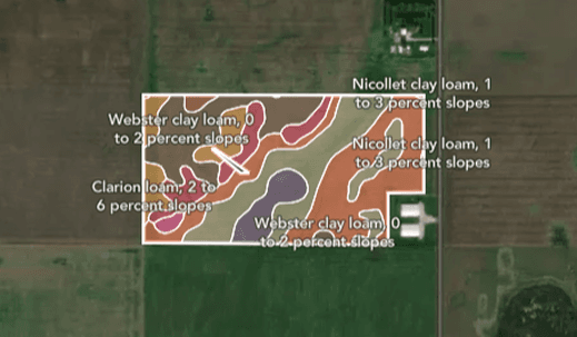
Soil and Yield Maps
Soil zones → plan seed placement
Yield goals → set targets from multi-year data
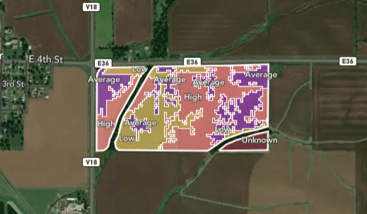
Planting and Zone Maps
Planting maps → what + where to plant
Management zones → divide fields for input strategy
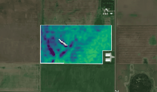
Imagery and Protection Maps
Imagery → detect stress
Crop protection → time applications
Irrigation
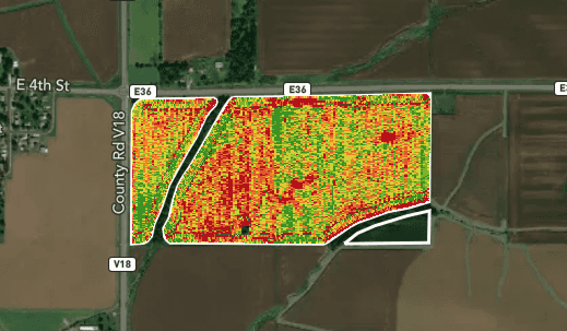
Harvest and Product Maps
Harvest data → assess performance
Product comparison → evaluate what worked
Why We Rebuilt — Not Just Migrated
The Old Tool Held Us Back
Slow at scale
Didn’t fit the new platform architecture
Copying It Would Repeat the Same Issues
Useful features buried under poor hierarchy
Others were too complex or slow to use
What We Did Instead
Kept what worked — restructured it
Made key actions more visible
Built for speed, scale, and flexibility
My Role
Co-led the redesign with another product designer.
Collaborated with:
What I did:
PMs & designers from 6 cross-functional teams
Platform engineers to assess tech capabilities
Audited the legacy tool across teams
Rebuilt flows based on actual user behavior
Designed a modular, scalable UI
Added high-impact tools for daily use
What Made This Migration Hard
Inconsistent Usage Across Teams
Many features were used differently across all 6 teams — nothing was documented.
→ We had to piece together usage patterns to understand what actually worked.
Hard to Act from the Map
Users often missed key actions and had to jump back and forth across workflows.
→ Especially painful when coming into the map hub from other tools.
Everyone Wanted Different Things
Each team expected something different from the map and pushed their own priorities.
→ We had to keep restraint and protect the shared core experience.
Research and Key Insights
We gathered inputs from PMs and designers across 6 teams — each representing their own users and workflows.
Layers Were Overwhelming
Too many layers, no search, and no clear structure.
→ Users struggled with map real estate — the map became too small once data and tools were layered on.
Core Tools Had Broken Workflows
Compare and Lasso were heavily used — but couldn’t work together.
→ Compare was manual, disconnected from the map view.
No Workflow Awareness
Users coming from other tools had no sense of where they were.
→ No way to return to their workflow or see relevant maps by default.
Inconsistent Layouts Across Maps
Each map had its own layout and behavior.
→ Users had to relearn controls every time — even for similar tasks.
Migration Strategy and Trade-Offs
Feature
Pre-Migration
Post-Migration
Reasoning
Layer Grouping |
Flat list, no hierarchy |
Grouped layers with filter + sort |
Made it faster to scan and locate relevant layers
Compare and Lasso Tools |
Present but not integrated |
Kept both, improved function & flow |
Reduced manual effort and made them usable together
Breadcrumb Navigation |
Not available |
Introduced |
Helped users return to workflow context without confusion
Map-Specific Functions |
Spread across different layout |
Consolidated into a single structure |
Reduced confusion - users didn't have to relearn layouts
Overlapping Panels |
Layers/tools/map overlapped and cluttered the view |
Collapsible side panels for layers and map |
Saved real estate and made the map the visual focus
Design Enhancements
Quick Actions on Each Map
Reference or compare other related layers quickly — without deep navigation.
Unified Map Layout
Constant layout across maps — every map works the same, no more relearning.
Clear Zones for Tools & Layers
Keep actions in one place and the map clean — collapsible panels maximize real estate.
Layer Grouping with Filter & Sort
Users find what they need faster with grouped, filterable, and searchable layers.
Visual Evolution
Visual Evolution
We didn’t just update the visuals — we redesigned how the map works. These side-by-side comparisons highlight key improvements in usability, clarity, and task flow.
Key Changes
Before

Layers were buried in a dropdown, unorganized, and overlapped the map.
Users had to scroll through a long flat list.
After
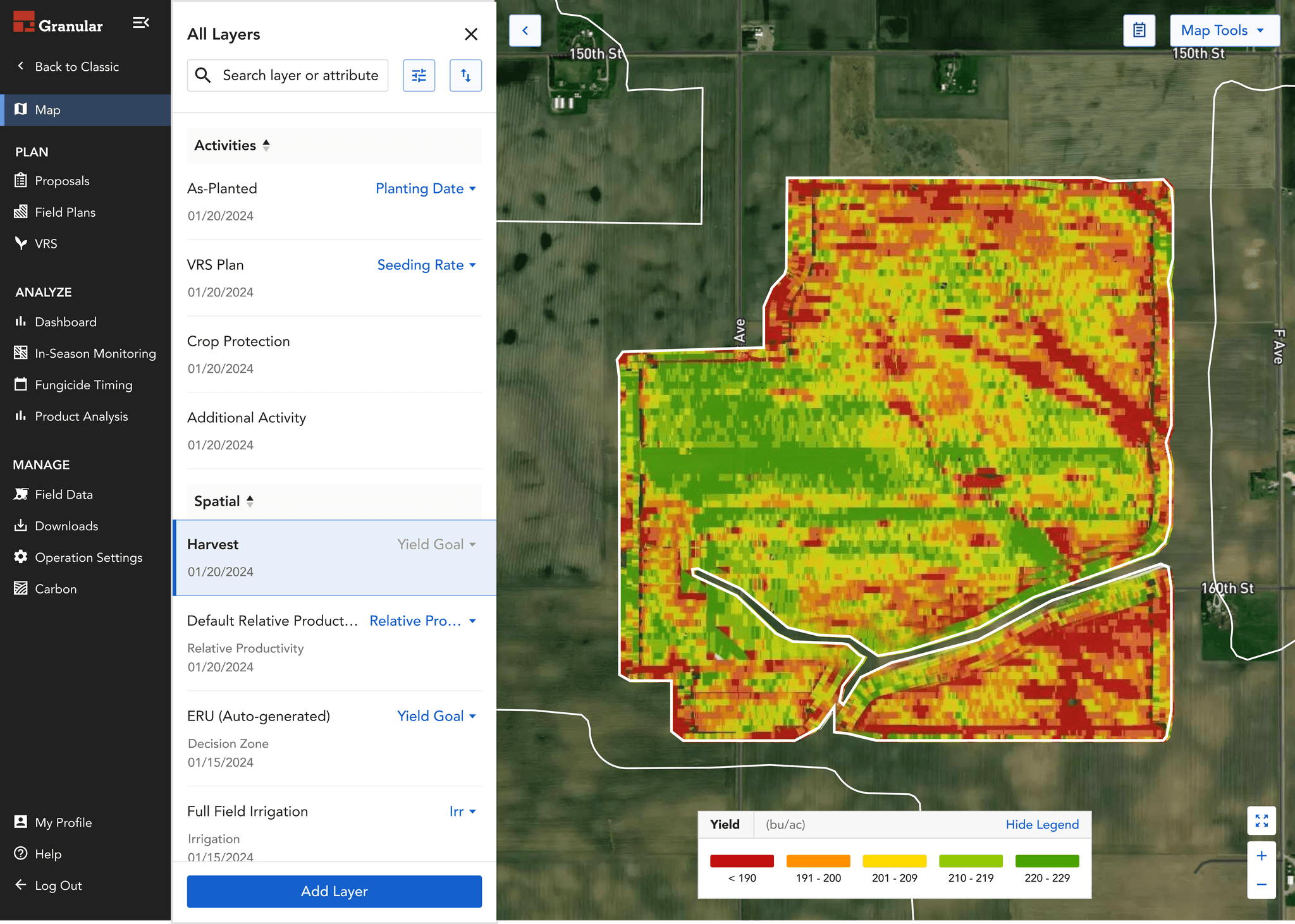
Layers now live in a side panel with grouping, filters, and sort — easier to scan, easier to manage.
Before

Tool panels and layer menus cluttered the screen and covered the map.
Too many commands stacked over the view.
After

We introduced collapsible panels and a clean legend, giving more space to the map and consolidating tools.
Before

Even with the improved Compare mode, it still required a full setup just to view comparisons.
Users had to switch modes and configure everything manually.
After

We introduced Quick Actions tailored to each layer — surfacing the most frequently used comparisons and tools with one click.
Users no longer needed to leave the current view.
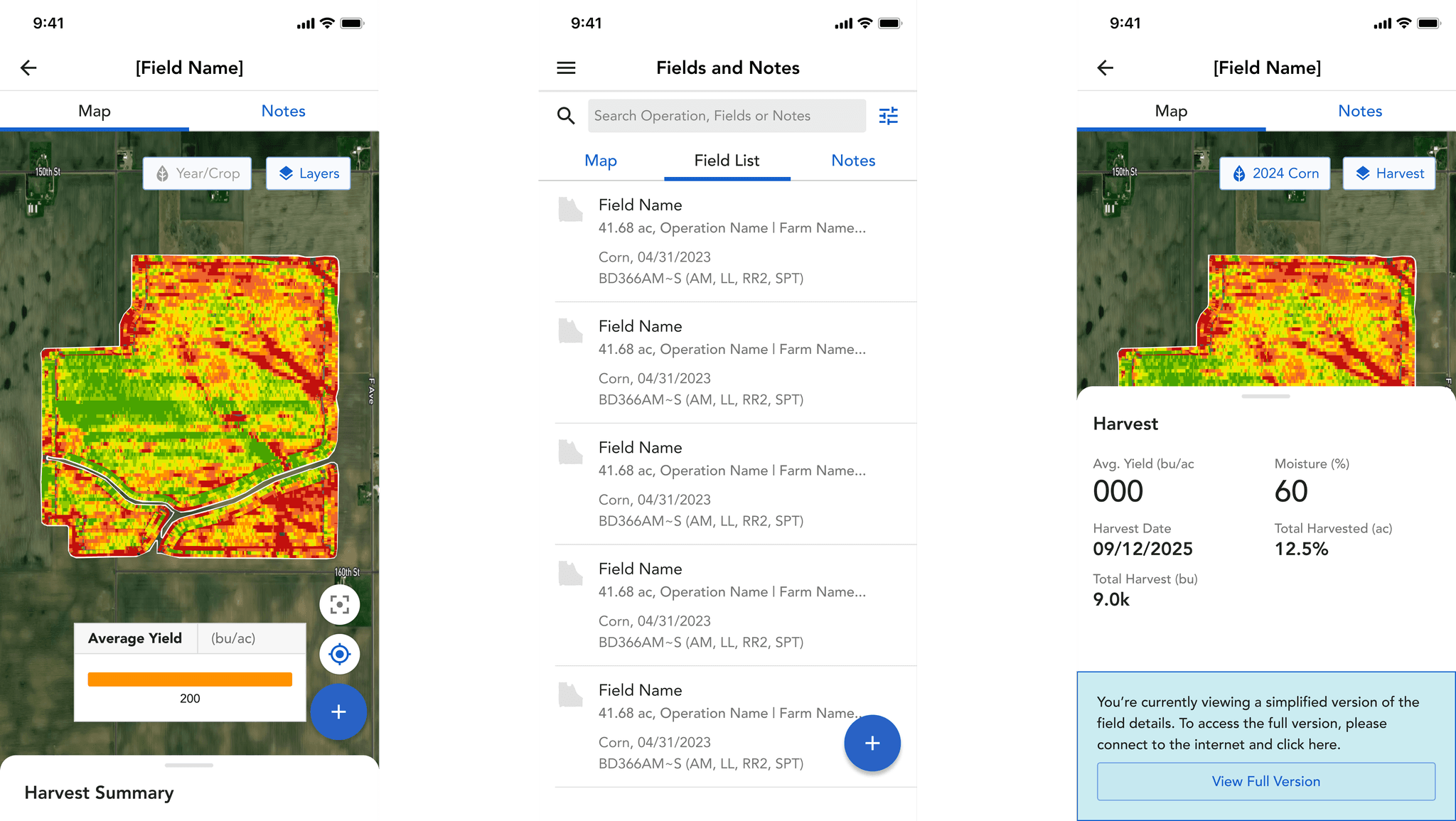
Designed for Mobile Too
The map tool was critical in the field, so we delivered a fully responsive experience.
We adapted all major workflows — including layer selection, map tools, and quick actions — for mobile use.
→ Field reps could act on insights without waiting to get back to a laptop.
Usability Testing & What Emerged
After launching the new tool internally, we ran usability tests with cross-team designers and PMs.
While the redesign solved major friction points, it revealed one clear gap:
8 Reps Interviewed
Users Needed to Layer Maps to See Cause & Effect
They wanted to view multiple layers at once, like soil quality over yield, to understand how one factor influenced another.
Toggling between maps broke that connection.
Multilayer Tool Was Born
We introduced a new tool that lets users view multiple layers simultaneously, with clarity and control.
→ This helped them see patterns, make faster decisions, and became one of the most appreciated additions post-launch.

Multilayer Setup
Multilayer Settings
Measurable Results
User Quote - Sales Rep
“Much easier to find layers — I’m so glad you have the full screen for the map now.”
User Quote - Associate Seller
“Multilayer looks amazing. It’s very useful during the planning phase each year.”
What's Next
With the foundation rebuilt, we’re now focused on making the map hub even more intelligent, flexible, and aligned with how users make decisions.
Coming next:
Simplified multi-year layer selection
→ Easily compare seasons without disrupting workflow flowSupport for complex, high-density layers
→ Handle layers with more granular, data-rich inputsMore flexible map + layer actions
→ Give users better control over what they can do with each mapAI-powered task recommendations
→ Help users take the right next step based on what the map is showing